

Connah Bowden. Photography is the freelance business of a friend of mine who documents landscapes, events, and everyday life with his camera, and skills. Very recently, he asked me to rebrand his social media logo. It needed a complete overhaul, and a fresh new look for the changing landscape of Instagram photography. The only condition he gave me was to keep the original logo's colour scheme.
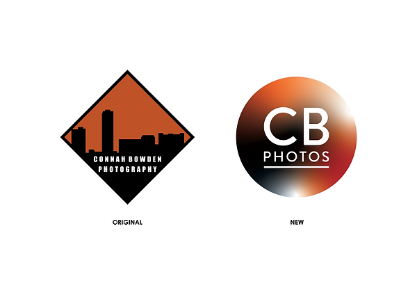
Although we agreed on keeping the same colour scheme as his original, I knew that the typeface needed a huge overall. So, I began working with the original text, and then evolving it into a more modern typeface suited for present day social media photography. I felt that a more rounded and clean font was the way forward, so I pushed my work in that direction. I also experimented with some different colours, and a circular logo. The circular logo worked beautifully, so I kept it in the final.


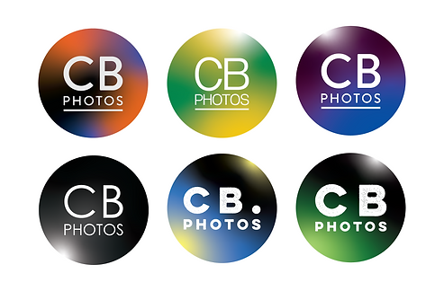
As seen above, you can see the clear evolution from the squared-off, and clunky original, to the more Instagram friendly circular logo with the refreshed font. I did experiment with different colours briefly, however I stook with the original plan as set out.