


IKE THOMAS BRANDING:
FROM CONCEPTION TO FINAL.
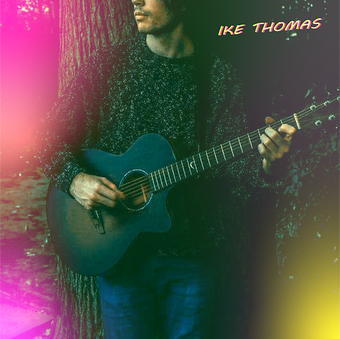

IKE THOMAS is a very close friend of mine who started out playing acoustically in 2021 in Liverpool. He needed his own brand and identity to go with his songs and play style. So he contacted myself, and together we began to visualise his artist identity with a YouTube/Spotify thumbnail , and secondly cover art for his three core original singles.

Each colour was chosen with purpose. The yellow signifies joy and optimism in his songs lyrics. The darker green and black show the more mellow and sombre sound of his playstyle and tone of voice. Lastly, the two shades of pink touch on a more feminine and psychedelic side of IKE THOMAS.
This fingerprint represents all of the colours used in IKE'S artist thumbnail image seen above. These colours were very carefully selected during the design process, as we both wanted to express his psychedelic song writing and play style through this artwork.


These are the nine different artist covers that I created with IKE'S input along the development process. We really wanted to play around with colour and typeface before we were sold on a final product that felt right. The thumbnail had to fit IKE's identity and playstyle correctly, so that a listener would know his sound beforehand. The thumbnail on the bottom right was the 'lightbulb' moment, and we developed it further to create the official piece.

As well as creating IKE'S official thumbnail image, I was also tasked to create single covers for two new songs that he had out at the time. Entitled, 'Her and I' (to the left) and 'Crooked Smile' (seen below) respectively, IKE asked myself to sit down and listen to these songs closely, and draw out what I was visualising in my head when I listened to these two tracks.
He wanted my initial, and raw reaction to these singles as a visual representation. After several listens to both pieces of music, these are the pieces of artwork that I came up with. Colourful, psychedelic, dreamy, cosmic and completely unconventional - very much fitting with IKE'S theme also.
IKE loved the final thumbnails that are on show here, and nothing has been altered by his request.
Touching on the colour palette and art style of these two pieces, myself and IKE felt as though they complimented his artist thumbnail very well. They have the same 'dreamy' and psychedelic tone to bring some unity to his brand, which in turn will make his act more popular and familiar with his listeners.
The choice of an alien planet shaded in bright pink was an immediate visual identity for myself as listened to his music. I believe that it captured the 'dreamy' and cosmic sound of his music as I described before. The choice of prop placement and architecture in 'Her and I' was simply a visual representation of the unconventional style of IKE'S musical tone, and same can be said for the latter piece, 'Crooked Smile'.
